Landing — Seasonal hero, featured pieces and newsletter capture.
Every page, and what’s in it
- LandingSeasonal hero, featured pieces and newsletter capture.
- LookbookFull-bleed scrolling editorial sequence.
- ShopPrice list grid with sizes and availability.
What’s included
- Full-height editorial hero
- Scrolling lookbook sequence
- Shop index with price list
- Serif display typography
Getting it running
Unzip the folder and run:
Open index.htmlThe download is the complete, unminified source with a README and the licence. Guides for every host, from Netlify to Shopify
DocumentationThe full README that comes in the download. Read it before you buy.
An editorial fashion template for a brand that sells a season rather than a SKU. Asymmetric grid, horizontal lookbook rail, and a shop that links out to whatever cart you already use.
Files
index.html      Hero, editorial grid, about, lookbook rail
lookbook.html   The full rail plus collection notes
shop.html       Product grid, sizing, care
assets/style.css   All styling; theme tokens at the top
assets/app.js      Rail (drag/keyboard/buttons), reveals, nav, newsletter
Running it
Double-click index.html, or npx serve ..
The lookbook rail
This is the piece worth understanding before you change it.
The rail is a native overflow-x container with CSS scroll snapping.
Touch scrolling, trackpad swipe, keyboard Tab into it and screen-reader
navigation all work with JavaScript switched off entirely. The JavaScript adds
three things on top:
- Arrow buttons that scroll by exactly one card width plus the gap
- Arrow-key support — the rail has
tabindex="0"and is a labelledrole="region" - Pointer drag for mouse users, who otherwise have to find a scrollbar
Two details that are easy to get wrong:
- Snapping is disabled mid-drag (
[data-dragging="true"]) and restored on release. Leave it on and the rail fights the pointer. - A drag that ends over a link must not follow it. The capture-phase click handler swallows the click when the pointer moved more than 6px. Without this, every drag ends on a product page.
Touch is deliberately left alone — pointerdown returns early for
pointerType === 'touch', because native momentum scrolling is better than
anything reimplemented in JavaScript.
To change card width, edit one value:
.look { width: min(420px, 78vw); }
The editorial grid
A 12-column grid where each figure sets its own span and aspect ratio:
.ed--a { grid-column: 1 / 6;  aspect-ratio: 3/4; }
.ed--b { grid-column: 7 / 13; aspect-ratio: 4/3; margin-bottom: 64px; }
The margin-bottom on .ed--b is what creates the offset, staggered feel —
the grid is align-items: end, so pushing one figure up breaks the baseline
deliberately. Remove it and the whole layout goes flat and ordinary.
Below 720px everything becomes full width at 4:5. Asymmetry needs room; on a phone it just reads as broken.
Using real photography
Every placeholder is inline SVG. Replace with images:
<figure class="ed ed--a">
  <img src="assets/img/look-01.jpg" alt="The Long Coat in undyed wool">
  <figcaption class="ed__cap">01 — The Long Coat</figcaption>
</figure>
Add these, because the SVGs get sizing from element selectors that don't cover
img:
.ed img, .look__img img, .piece__img img {
  width: 100%; height: 100%; object-fit: cover;
}
Shoot portrait at 3:4 for looks and products. The rail is 3:4 and the shop grid is 3:4; landscape crops fight both.
Wiring up the shop
The product grid links to shop.html as a placeholder. This template is
deliberately not a full cart — a fashion brand at this scale is almost
always better served pointing at Shopify, Squarespace Commerce, or a Stripe
payment link than running its own checkout.
- Shopify Buy Button — paste their embed into
.piece - Stripe payment links — one URL per product, set it as the
href - Full cart — if you want one in this style, the store's Aurora Commerce template has a working cart drawer you can lift
Theming
:root {
  --accent: #b03a6a;    /* used sparingly — labels and one hover state */
  --surface: #faf8f6;   /* warm paper */
  --dark: #14100f;      /* footer and newsletter */
}
The accent appears on perhaps six elements per page, on purpose. In an editorial layout the photography carries the colour; a loud accent competes with it. If you brighten the accent, use it less, not more.
Accessibility notes
- The rail is a labelled
role="region"and keyboard-operable; arrow buttons disable at each end rather than silently doing nothing. - The ticker is
aria-hidden— decorative, and its text repeats. - Product cards use a stretched link, so the card is clickable while exactly one link is announced.
mix-blend-modeon the hero headline is decorative only; the text stays real text and remains selectable and readable.- All motion, including the ticker and the reveals, stops under
prefers-reduced-motion.
Browser support
Uses color-mix() (2023+) for the translucent header and Pointer Events for
drag. Both degrade gracefully — without color-mix() you get a solid header,
and without the drag handler the rail still scrolls natively.
Reviews
No reviews yet. Only verified buyers can review.
You might also like
 Pro Live preview
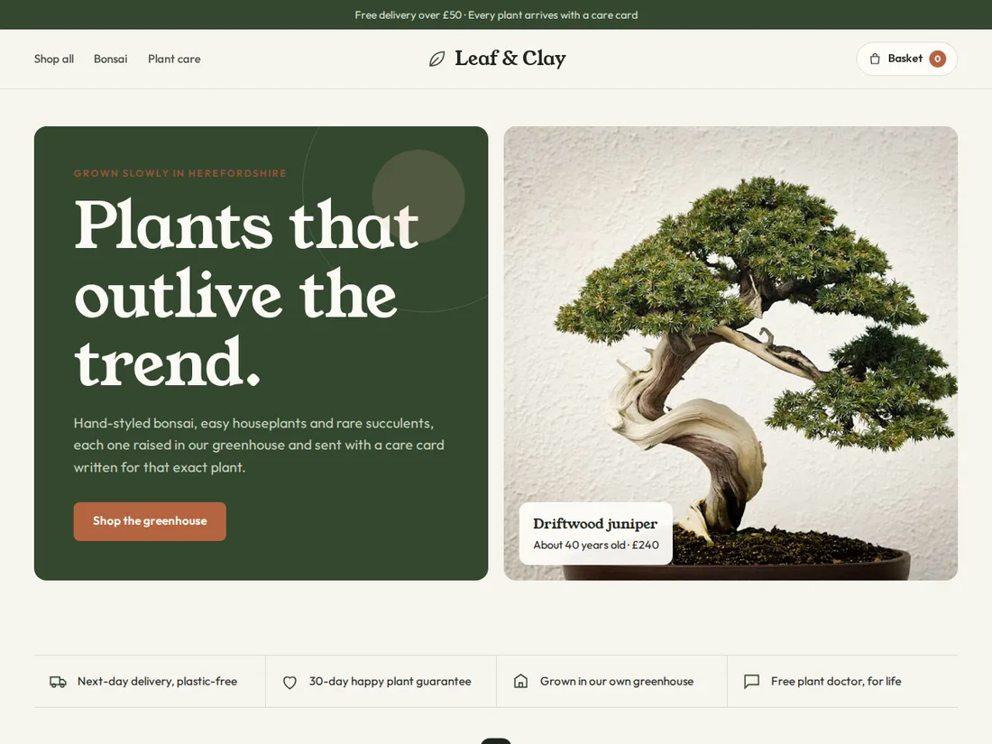
Leaf & Clay
Plant & bonsai shop
An earthy online shop with categories, a filterable product grid, a slide-out basket with a free-delivery bar, a product page with options and care tabs, and a care hub.
 Pro Live preview
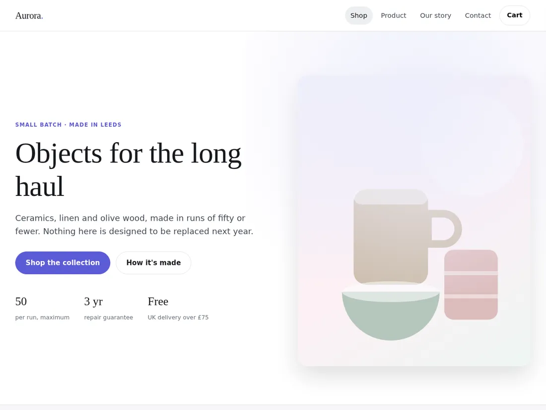
Aurora Commerce
Small online store
A four-page storefront with a product grid, a detail page with variant selection, an about page and a contact form.
 Pro Live preview
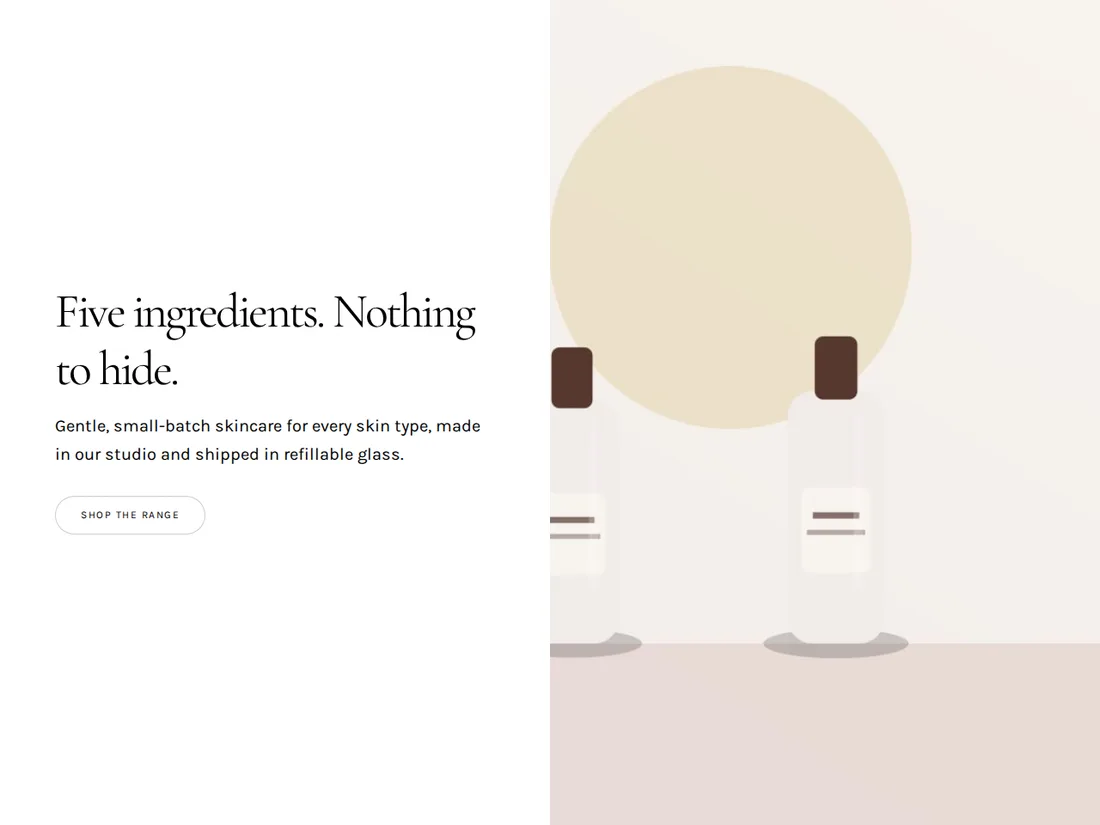
Dewline
Skincare shop
A calm, image-led storefront for a skincare brand: hero product, ingredient story, a shop grid and reviews, with plenty of white space.