Landing — Hand-drawn SVG app mockup, how-it-works walkthrough, pricing table and FAQ.
Every page, and what’s in it
- LandingHand-drawn SVG app mockup, how-it-works walkthrough, pricing table and FAQ.
- ChangelogVersioned release notes with type tags and dates.
What’s included
- Inline SVG product mockup — no screenshots to maintain
- Pricing table and FAQ
- Separate changelog page
- Scroll reveals with no library
- Responsive nav with accessible toggle
Getting it running
Unzip the folder and run:
Open index.htmlThe download is the complete, unminified source with a README and the licence. Guides for every host, from Netlify to Shopify
DocumentationThe full README that comes in the download. Read it before you buy.
A SaaS landing page ordered the way a landing page actually converts: claim, proof, mechanism, price, objections, close. Plain HTML, CSS and JavaScript.
Files
index.html       The landing page
changelog.html   A changelog / release-notes page
assets/style.css   All styling; theme tokens at the top
assets/app.js      Pricing toggle, scroll reveals, nav, form validation
Running it
Double-click index.html, or npx serve ..
The pricing toggle
Monthly and annual prices are both in the markup, as data attributes — the JavaScript only swaps which one is shown:
<b data-price data-price-annual="$23">$29</b>
<span data-period-label>/month</span>
This is deliberate. Computing the annual price as monthly * 0.8 looks tidier
but breaks the moment one plan has a different discount, and it puts your
pricing logic somewhere a non-developer can't edit it. Change the numbers in
the HTML.
The label next to the price is swapped too, so annual reads "/mo, billed yearly" rather than implying a monthly charge.
The comparison table
.compare scrolls horizontally below 960px instead of collapsing into cards.
Cards are prettier; a scrollable table is the thing people can actually compare
values in. Each row uses <th scope="row"> so screen readers announce the
feature name with every cell.
Sections, and whether to keep them
| Section | Keep it if |
|---|---|
| Hero + mock | Always |
| Logo row | You have real customers. An invented logo row is worse than none. |
| How it works | The product needs a mechanism explained |
| Showcase blocks | You have two or three features worth a paragraph each |
| Pricing | You have public pricing. If you don't, replace with a contact CTA. |
| Testimonials | They're real and attributed |
| FAQ | Always — it's the highest-converting section on most pages |
| Closing CTA | Always |
Delete what doesn't apply. A short honest page beats a long padded one.
Theming
Top of assets/style.css:
:root {
  --accent: #2f9e7f;
  --accent-dark: #258066;
  --accent-soft: #e6f5f0;
  --accent-ring: rgba(47, 158, 127, .3);
  ...
}
Change all four accent values together. --accent-ring is the focus outline —
it needs to stay visible against --surface, so keep it at roughly 30% alpha.
The waitlist form
Validates but doesn't send. Give it an action, or post it yourself:
<form action="https://formspree.io/f/YOUR_ID" method="POST" data-waitlist>
Set data-success="..." to change the confirmation message per form.
The app mock
The hero screenshot is inline SVG, so it's sharp on any display and adds no requests. When you have a real screenshot:
<div class="mock">
  <div class="mock__bar">…</div>
  <img src="assets/img/app.png" alt="The Vertex changelog editor">
</div>
Export at 2× the display width and keep the browser chrome bar — it reads as a product rather than a picture.
Accessibility notes
- The pricing toggle uses
aria-pressedon real buttons, not styled radios. - The comparison table has a
<caption>(visually hidden) and row headers. - FAQ uses native
<details>, so it works with JavaScript disabled. - All reveal animations are disabled under
prefers-reduced-motion, and content is visible by default ifIntersectionObserveris unavailable.
Browser support
Anything from the last three years. No build step, no dependencies.
Reviews
No reviews yet. Only verified buyers can review.
You might also like
 Premium Live preview
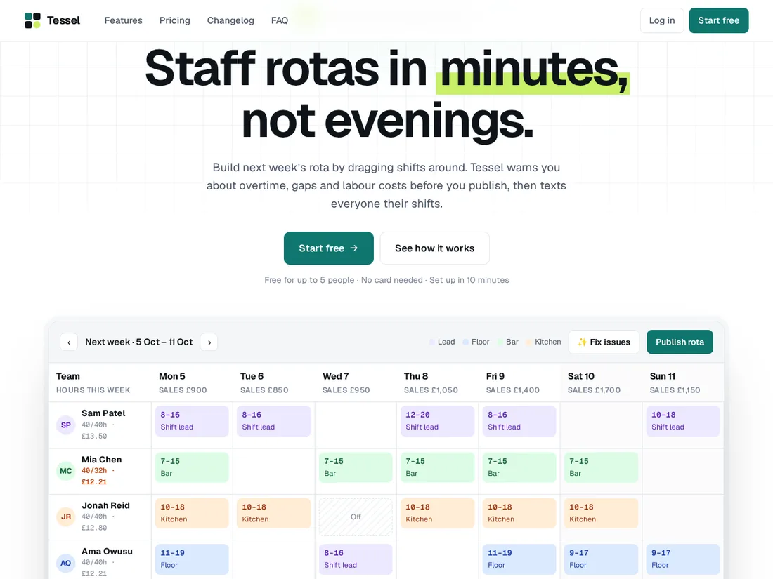
Tessel
SaaS product site with a live demo
A modern SaaS site whose hero is a working product: drag shifts around a staff rota and watch costs and rule checks update. Plus a feature tour, pricing calculator, changelog and onboarding wizard.
 Pro
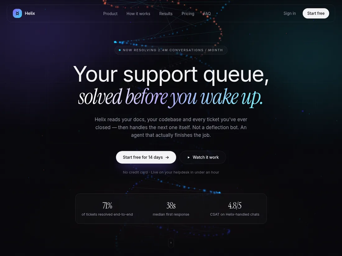
Helix
AI SaaS landing page
A cinematic dark landing page for an AI product, built around a hand-written WebGL particle hero and a self-playing product demo.
 Pro Live preview
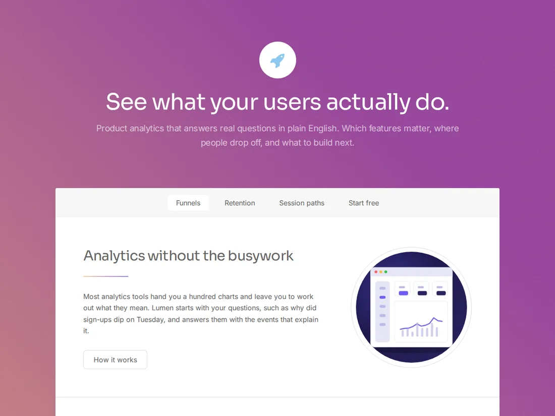
Lumen
Product analytics
A soft-gradient launch site for an analytics product: sticky section nav, feature stats, pricing and a get-started page.