Home — Positioning statement, capabilities, and selected work.
Every page, and what’s in it
- HomePositioning statement, capabilities, and selected work.
- WorkCase-study index with filtering by discipline.
- StudioTeam, process and credentials.
- ContactProject brief form with validation and budget ranges.
What’s included
- Case-study index and detail layout
- Team and capability sections
- Enquiry form with client-side validation
- Editorial typographic scale
Getting it running
Unzip the folder and run:
Open index.htmlThe download is the complete, unminified source with a README and the licence. Guides for every host, from Netlify to Shopify
DocumentationThe full README that comes in the download. Read it before you buy.
An agency / professional-services site structured so a two-person studio and a twenty-person agency both fit. Plain HTML, CSS and JavaScript.
Files
index.html     Hero, stats, services, selected work, process, quote
work.html      Case study index plus one written out in full
about.html     Studio, team, pricing, work you turn down
contact.html   Enquiry form and details
assets/style.css   All styling; theme tokens at the top
assets/app.js      Nav, scroll reveals, form validation
Running it
Double-click index.html, or npx serve ..
Making the copy yours
This template ships with opinionated placeholder copy — a studio that turns work down, publishes its prices, and writes up a project that went wrong. That is deliberate: it's easier to soften specific copy than to invent it from "Lorem ipsum dolor sit amet."
The three places worth keeping the shape of, whatever you write:
The process section. Five stages, each with a duration and a deliverable. Prospects use this to work out whether you're expensive or slow, and vagueness reads as both.
"Work we turn down" on about.html. Counter-intuitively this converts —
it tells a good-fit client they're a good fit. Keep it honest or delete it;
a list of things you'd obviously never be asked to do is worse than nothing.
"What we would do differently" in the case study. One real mistake, stated plainly. Every agency site claims a flawless record and nobody believes any of them.
Case study cards
Each card is a <article class="case"> with a stretched link
(.case__title::after), so the whole card is clickable while screen readers
still announce exactly one link.
The three result figures come from .case__result:
<div class="case__result">
  <div><b>−41%</b><span>support tickets</span></div>
  <div><b>4 min</b><span>time to first report</span></div>
</div>
Use the client's own numbers and say when they were measured. An unattributed percentage is read as invented, because usually it is.
The team section
Four portraits in a 4-up grid, dropping to 2-up then 1-up. Placeholders are inline SVG; swap for photographs:
<div class="person__photo">
  <img src="assets/img/ada.jpg" alt="Ada Sørensen">
</div>
Add .person__photo img { width: 100%; height: 100%; object-fit: cover; } —
the SVGs get sizing from .person__photo svg, images need their own rule.
The container is aspect-ratio: 4/5, so shoot or crop portrait.
The contact form
Validates on submit: name present, plausible email, and a message of at least
twenty characters (a one-word enquiry helps nobody). Errors are per field with
aria-invalid, and focus moves to the first problem — important for keyboard
users, who otherwise get an error message they never see.
The budget selector is real radio inputs styled as cards, so it works with a keyboard and is announced as a radio group.
To make it send, add an action:
<form action="https://formspree.io/f/YOUR_ID" method="POST" data-contact>
and remove the event.preventDefault() in initContact() — or keep it and
post with fetch. Both approaches are in the store's contact-form tutorial.
Theming
:root {
  --accent: #3f6f8f;       /* slate blue */
  --accent-dark: #325a75;
  --accent-soft: #e9f0f5;
  --dark: #11171c;         /* dark sections and footer */
  ...
}
This palette is deliberately low-saturation — it's a professional-services site
and the work in the case studies should be the most colourful thing on screen.
If you raise the saturation, drop --accent-soft to compensate or the tinted
panels start to shout.
Accessibility notes
- One
<h1>per page, headings in order, no levels skipped. - Stretched-link cards keep a single accessible link each.
- Form errors are tied to fields with
aria-invalidand focus moves to the first failure. - Budget selector is a labelled
role="radiogroup"over real inputs. - Reveal animations are disabled under
prefers-reduced-motion, and content shows by default ifIntersectionObserveris missing.
Browser support
Anything from the last three years. No build step, no dependencies.
Reviews
No reviews yet. Only verified buyers can review.
You might also like
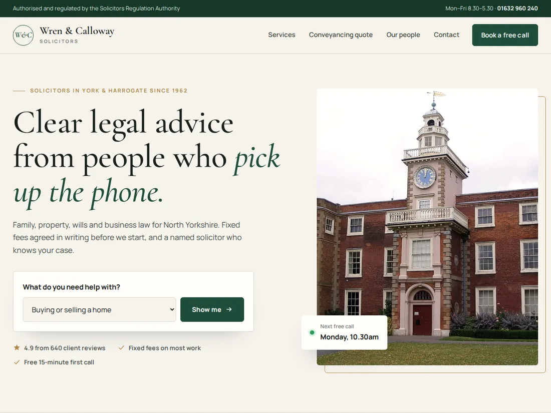 Premium Live preview
Wren & Calloway
Law firm & professional practice
A polished law-firm site with a “what do you need?” finder, practice areas, an instant conveyancing quote with a Stamp Duty calculator, a practice page with fees and a timeline, and free-call booking.
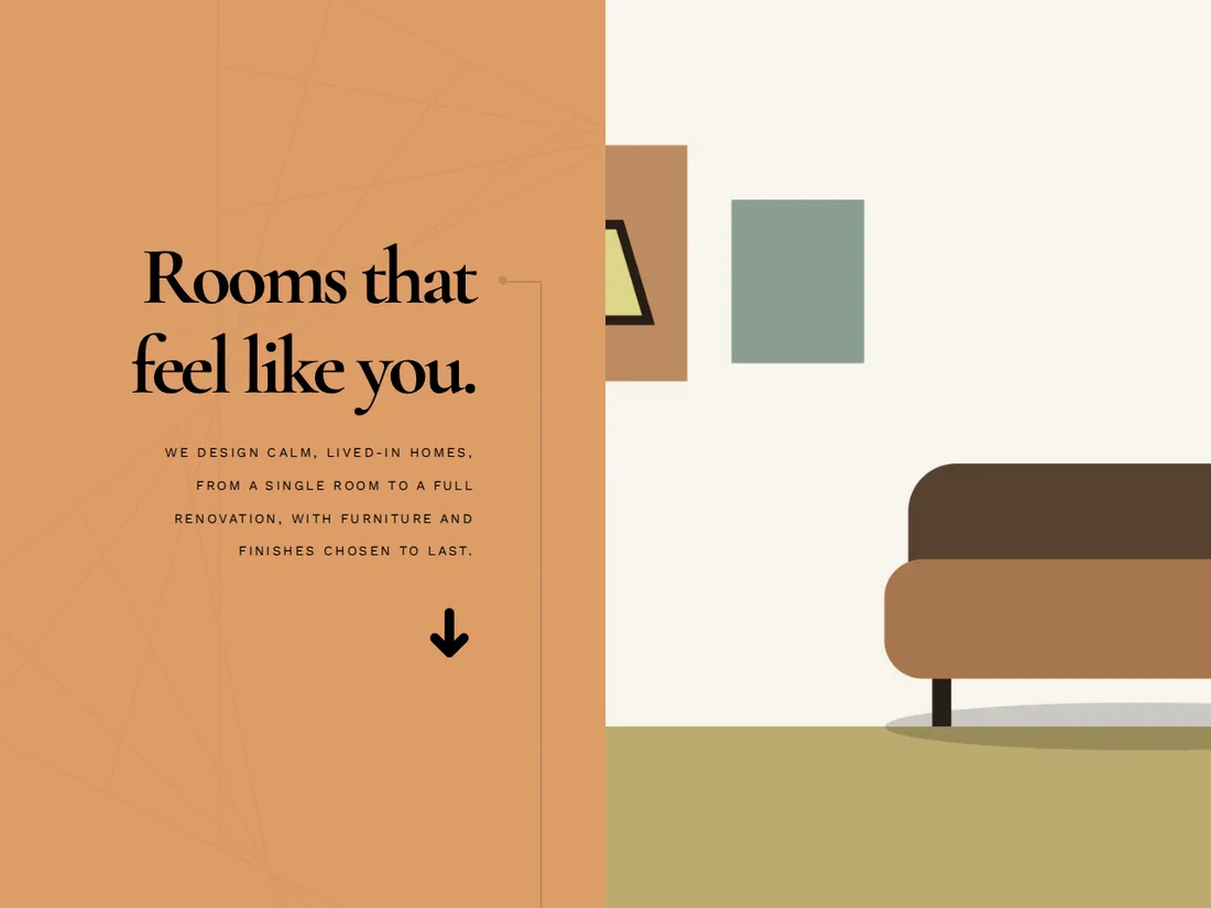 Starter Live preview
Atelier Nord
Interior design studio
A bold split-screen site for an interior design studio, with oversized type, an asymmetric project gallery and an enquiry form.
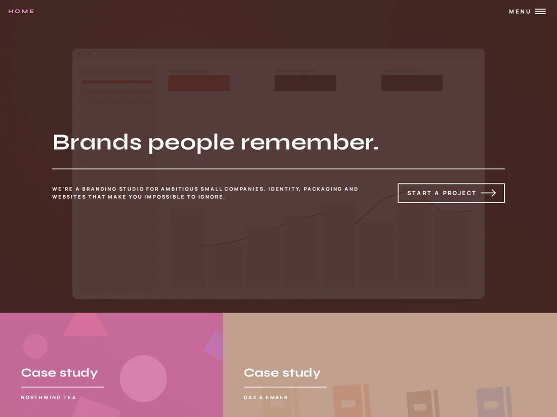 Premium Live preview
Brightside
Branding studio
A dramatic tiled studio site: each colour block is a case study, opening onto project, services and contact pages.