Journal — Essay index with reading times and excerpts.
Every page, and what’s in it
- JournalEssay index with reading times and excerpts.
- ArticleLong-form layout with pull quotes, footnotes and code blocks.
- ArchiveComplete index grouped by year.
What’s included
- Article layout tuned for reading length
- Archive index grouped by year
- Pull quotes, footnotes and code blocks
- Light and dark reading modes
Getting it running
Unzip the folder and run:
Open index.htmlThe download is the complete, unminified source with a README and the licence. Guides for every host, from Netlify to Shopify
DocumentationThe full README that comes in the download. Read it before you buy.
A reading experience rather than a blog theme. The type scale and the measure are the design; everything else gets out of the way.
Files
index.html     Lead post plus a list of recent ones
archive.html   Everything, searchable and filterable
article.html   The long-form article layout
assets/style.css   All styling; type tokens at the top
assets/app.js      Search, tag filtering, reading progress, reading time
Running it
Double-click index.html, or npx serve ..
The measure
:root {
  --measure: 39rem;       /* body text — about 68 characters */
  --measure-wide: 46rem;  /* post lists — about 82 characters */
}
68 characters is the cap for a reason: long lines are the most common reason people stop reading, and no amount of styling compensates. If you widen this, widen the leading too or the eye loses its place returning to the next line.
Why rem and not ch. ch is the width of a 0 in that element's own
font. The article header is set in the sans UI font and the body in the reading
serif, so 68ch resolves to two different pixel widths and the two blocks stop
sharing a left edge — a misalignment that is obvious once you notice it and
maddening to track down. rem is font-independent, so the whole column lines up.
Three fonts do three jobs:
| Variable | Used for | Why |
|---|---|---|
--font-reading |
Article body, excerpts | A serif at 1.14rem, sized for sustained reading |
--font-display |
Headlines | Instrument Serif, for contrast at large sizes |
--font-body |
UI, captions, metadata | Inter, because it disappears |
Swapping the reading serif is the highest-leverage change you can make. Source Serif 4, Charter, Literata and Iowan Old Style all work; anything designed for headlines will not.
Adding posts
Posts are markup, not a CMS. Copy an <article class="post"> block:
<article class="post" data-post
         data-tags="craft software"
         data-search-text="Title and excerpt, flattened for searching">
  <time class="post__date" datetime="2026-03-02">2 March 2026</time>
  <div>
    <a class="post__title" href="article.html">The title</a>
    <p class="post__excerpt">One or two sentences.</p>
    <div class="post__foot">
      <a class="tag" href="archive.html">craft</a>
    </div>
  </div>
</article>
data-tagsis space-separated and drives the filter bar.data-search-textis what search matches against. Leave it off and search falls back to the element's text content, which works but also matches the date.- Add new tags to the
.tag-baras<button class="tag" data-tag="yourtag">.
Search and filtering run over the DOM, with no index and no fetch. That's
the right trade-off up to a few hundred posts — it works from file://, has no
build step, and adds no requests. Past a few hundred, generate a JSON index at
build time and swap initFilters() for a fetch.
Pressing / anywhere focuses the search box, which is the convention readers expect. Escape closes it and returns focus to the toggle.
The article layout
Everything in .prose is styled: headings, lists, links, <pre>, inline
<code>, blockquotes with <cite>, and figures with captions.
Footnotes are plain anchor links — a .fn marker in the text pointing at an
<li> in .footnotes, with a return link back. They work with JavaScript
disabled, and the target footnote highlights via li:target.
Reading time is computed from the article's own word count at 230 wpm, so it can't drift out of sync the way a hand-written number does.
The progress bar is 3px. Resist making it thicker — it's a peripheral cue, and anything larger competes with the text it's measuring.
The newsletter form
Validates but doesn't send. Point it at Buttondown, ConvertKit, Listmonk, or your own endpoint:
<form action="https://buttondown.email/api/emails/embed-subscribe/YOU"
      method="post" data-subscribe>
and drop the event.preventDefault() in initSubscribe().
Theming
:root {
  --accent: #8f5f3f;     /* links, rules, the progress bar */
  --surface: #fdfcfa;    /* warm off-white — not #fff */
  --ink: #1c1917;        /* warm near-black — not #000 */
}
The warmth is doing real work here: pure white on pure black is harsher to read
for long stretches. If you go cooler, move --surface and --ink together or
it looks like a mistake rather than a choice.
Accessibility notes
- One
<h1>per page and headings in strict order — screen reader users navigate long articles by heading, and a skipped level breaks that. <time datetime>on every date.- The search box has a real (visually hidden)
<label>. - Tag buttons use
aria-pressed; tags inside a post stay ordinary links. - Progress bar is
role="presentation"— it's decorative, and announcing a percentage on every scroll would be miserable. - Scroll handling is throttled with
requestAnimationFrameand the listener is passive, so scrolling stays smooth on a phone.
Browser support
Anything from the last three years. No build step, no dependencies.
Reviews
No reviews yet. Only verified buyers can review.
You might also like
 Pro Live preview
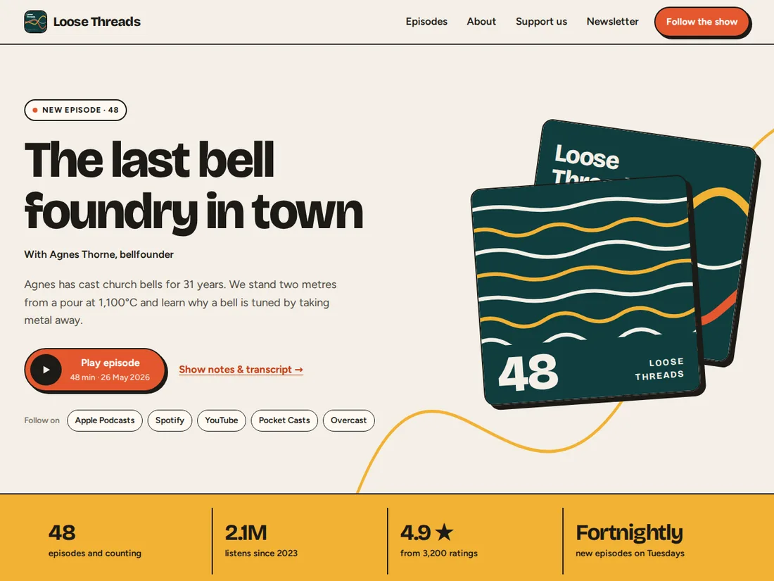
Loose Threads
Podcast website
A bold podcast site with a sticky audio player that remembers where listeners stopped, a searchable episode list, chapters and a transcript that follows the audio, and a membership page.
 Pro Live preview
Wayfarer
Travel magazine
A spacious editorial travel magazine: a dramatic cover intro, a featured story, a grid of articles and a full article page.
 Premium Live preview
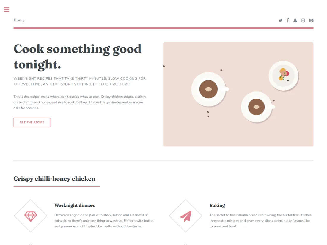
Salt & Ember
Recipe blog
A magazine-style recipe hub with a sidebar menu, featured recipe, category grid and a full recipe page layout.