Gallery — Full-bleed grid with a keyboard-navigable lightbox.
Every page, and what’s in it
- GalleryFull-bleed grid with a keyboard-navigable lightbox.
- Case studyWide imagery interleaved with project narrative.
- ContactCommission enquiry form and current availability.
What’s included
- Full-bleed gallery grid
- Case-study layout with wide imagery
- Keyboard-navigable lightbox
- Dark, gallery-style presentation
Getting it running
Unzip the folder and run:
Open index.htmlThe download is the complete, unminified source with a README and the licence. Guides for every host, from Netlify to Shopify
DocumentationThe full README that comes in the download. Read it before you buy.
A dark, typographic portfolio for work that should be louder than the layout. Plain HTML, CSS and JavaScript — no build step, no dependencies.
Files
index.html       Hero, indexed work list, frame gallery
case-study.html  A single project, long-form
contact.html     Form plus details
assets/style.css   Both palettes live at the top of this file
assets/app.js      Theme toggle, scroll reveals, nav, form validation
Running it
Double-click index.html. Or npx serve . if you prefer a local server.
The theme toggle
Dark is the default and stays the default. The toggle writes the choice to
localStorage and a small inline script in each <head> reads it before
first paint, so there's no flash of the wrong theme on load.
The site deliberately does not follow the visitor's OS
prefers-color-scheme. Dark is the design here rather than a preference, and a
visitor arriving on a light-mode machine should still see the template as it
was built. Only the toggle overrides it, and that choice persists.
If you would rather follow the OS, add this to the inline script in each
<head>, after the localStorage check:
if (!saved && window.matchMedia('(prefers-color-scheme: light)').matches) {
  document.documentElement.setAttribute('data-theme', 'light');
}
Both palettes are at the top of assets/style.css:
:root            { --bg: #0d0e11; --fg: #f2f3f5; --accent: #d6a45b; ... }
[data-theme="light"] { --bg: #fbfaf8; --fg: #16171a; --accent: #96662a; ... }
Change both blocks together. Editing only :root leaves the light theme
looking broken, and that's the single most common mistake with this template.
If you don't want a light theme at all: delete the [data-theme="light"] block,
the .theme-toggle button, and the inline <head> script.
Adding work
The work list on index.html is plain markup — copy one <article class="piece">
and edit it. Keep the data-reveal-delay increasing by about 60ms per row so
they arrive in sequence rather than all at once.
The gallery uses a 12-column grid with four frame sizes:
| Class | Columns | Aspect |
|---|---|---|
.frame--full |
12 | 21:9 |
.frame--wide |
8 | 16:10 |
.frame--half |
6 | 3:2 |
.frame--tall |
4 | 4:5 |
Using real photographs
The placeholders are inline SVG. Swap in an image and keep the <figure>:
<figure class="frame frame--wide" data-reveal>
  <img src="assets/img/hull-01.jpg" alt="Trawler at first light">
  <figcaption>Sound of the Hull — 01</figcaption>
</figure>
Add .frame img { width: 100%; height: 100%; object-fit: cover; } to the
stylesheet — the SVGs get this from .frame svg, images need it too.
Typography
Two fonts: Instrument Serif for display, Inter for body, JetBrains Mono for labels. The mono labels are doing a lot of the work in this design — if you change that font, pick another monospace or the whole thing loosens up.
Headline sizes use clamp() and scale with the viewport. h1 goes up to
8.5rem, which is intentional and looks wrong at first glance in a narrow
editor window. Look at it in a browser before changing it.
The contact form
Validates client-side but doesn't send. Give it an action:
<form class="form" action="https://formspree.io/f/YOUR_ID" method="POST" data-contact>
Then remove the event.preventDefault() in initForm() in app.js, or keep
it and post with fetch — the store's Making the contact form actually send
tutorial covers both.
Accessibility notes
- Theme toggle updates its own
aria-labelto describe what it will do next. - The work list uses a stretched-link pattern (
.piece__title::after), so the whole row is clickable but screen readers still announce one link. - Every decorative SVG has a real
aria-labeldescribing the photograph. - All motion is disabled under
prefers-reduced-motion.
Browser support
Uses color-mix() for the translucent header, which needs a browser from 2023
or later. If you need older support, replace that one line with a plain
rgba() value.
Reviews
No reviews yet. Only verified buyers can review.
You might also like
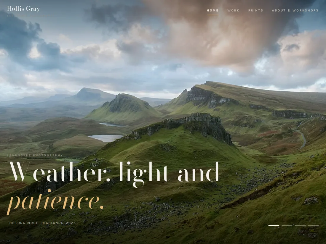 Pro Live preview
Hollis Gray
Landscape photographer
A dark, image-first portfolio: a full-screen slideshow, series, a masonry gallery with filters and a full-screen viewer, a print shop and workshops.
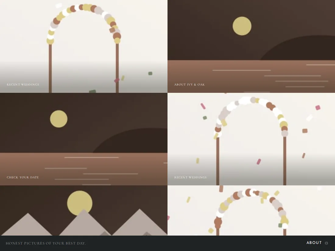 Starter Live preview
Ivy & Oak
Wedding photography
A full-screen gallery portfolio for a wedding photographer: a wall of images, lightbox viewing and an about-and-contact panel.
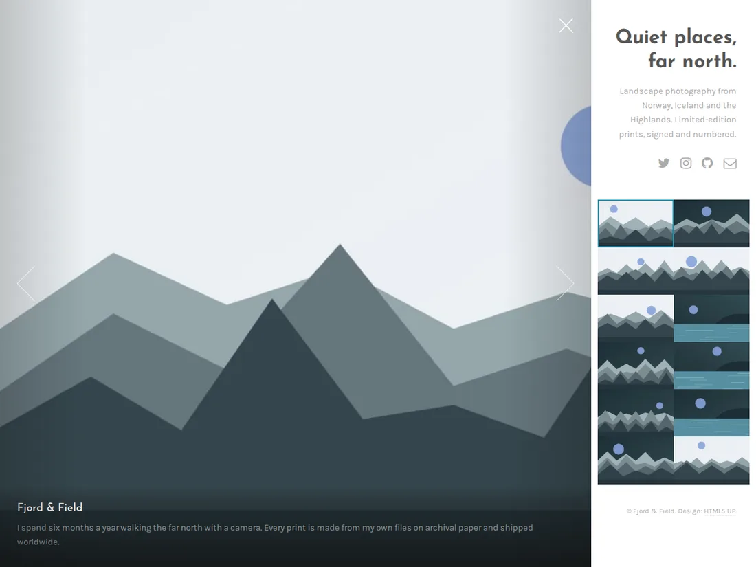 Starter Live preview
Fjord & Field
Landscape photography
A compact gallery portfolio with a thumbnail sidebar and a full-bleed viewer, built for showing landscape work at its best.